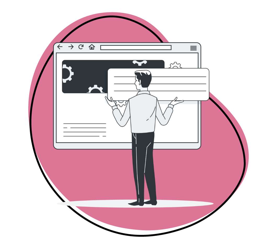
Graphic designers and businesses alike all dream of clean, and simple visuals that present all the information they require in a glance. Dashboard design, which is often requested by clients, is the perfect example of creating a visual that showcases all the information, trends and risk areas, that will provide your users with actionable results.
Dashboards powerfully and effectively display data-based intelligence, visually. The best dashboard design examples clearly present relevant and actionable data. They also track stats and key performance indicators (KPIs). When dashboard design best practices are properly implemented, everything you need to know is consolidated and presented on a single screen. The goal is to design a quick, clear, and easy-to-scan visual with the most relevant information available at a glance.
A dashboard is a visual display of the most important information needed to achieve one or more objectives. When embarking on designing a dashboard, it can feel overwhelming, which is exactly why we’ve curated this list of dashboard design principles, and tools for dashboard design to help you design the ultimate dashboard design.
Dashboard Design Best Practices
Design choices and the tools for dashboard design that you implement must serve the number one goal: creating a visual deliverable that is well received and easily understood by the reader. Communicate data and important information with user-centered, goal-centric designs that follow dashboard design best practices. Every dashboard will be unique according to its own set of goals, requirements, and limitations, but understanding fundamental dashboard design principles will help make your design stand out and showcase the most important aspects, visually.
1. Defining and determining dashboard goals
First and foremost, it’s essential to consider your end goal. Empathize with your users and understand their goals, by asking what information does the reader need? Defining and determining your goals so that you create a goal-centric design ensures you address real problems and present realistic solutions in a way that is understood quickly.
When considering dashboard design best practices, it’s essential to begin with a general overview that goes into more detail as you move through the dashboard. Your job, as the designer is to prioritize the key metrics, and to create a compelling story through visuals that keeps your reader interested and in the know.
Consider the project goals, the nature of the data, and the needs of users when designing your dashboard. Present the most important data first and allow users access to supporting or secondary metrics to expand on those figures. Start out with a broad view of and get clear on the business objectives, narrow down accordingly, and then present the key information that is crucial to a larger overarching goal.
2. Dashboard design principles: intuitive, clear, and customizable
When considering dashboard design principles, it’s important to start with clarity and the idea of simplifying complex data that ensures stakeholders understand key insights at a glance. Keep in mind that the more information on display, the harder it is for users to understand the bigger picture. You’ll know you’ve achieved clarity when everything required is immediately accessible, the information is communicated in an easily digestible way, trends and changes in data are clearly displayed, and they are easily customizable.
This is much easier said than done! You’re likely going to be dealing with a ton of information that may feel overwhelming to sift through. In order to minimize users’ cognitive load, it’s important for the interface to present the appropriate data in the most straightforward manner. Customizable dashboards that can be tailored to different users is a key part of this process.
3. The best dashboard design examples utilize user researcher
As with an effective design, understanding our user is the crux of great designs. This is true when we analyze the best dashboard design examples and being implementing dashboard design principles. It’s important to take a step back and view the dashboard from their point of view. Anything designed with them in mind tends to attract the most positive reactions. So with that in mind, frame your dashboard design according to specific goals discussed above. It’s essential that you effectively simplify complex data in bite-size chunks. The most effective way to do is is by applying user research techniques.
By understanding the readers better, we can embrace simple mindset shifts and tackle problems from a new direction that helps designers create innovative solutions, overcome challenges, and produce successful dashboard designs. The purpose of your dashboard is to define the core problems, goals, and solutions, then showcase it in a human-centered manner that’s easily digestible.
Define the different user types and recognize where goals match up, and where they differ. What data or information will be deemed the most important or actionable to one user type vs. another? Depending on the user, information may require a different layout, or you may discover that there is a solution for designing a more general use case.
This is where user research comes into play. Begin with rudimentary wireframes and prototypes that can be tested with users during the user research phase. This is where you often find the most valuable insights. When you consider the feedback and insights you can gain from a select group of users, you can see just how much time you’ll save down the line.
User research can be implemented to ensure the data presented is relevant, clear, and concise to the intended audience. With user research, we effectively determine the user’s goals, context, mental models, and challenges. These factors greatly influence the outcome of the dashboard design. Viewing the dashboard through this lens ensures the content and the data they’re looking for is front and center.
4. Context
Clearly defining the parameters and providing context, is essential for quickly showing whether numbers are good or bad, typical or unusual. Without context, the KPIs, data, and information provided on a dashboard are not actionable or meaningful to the users.
Provide maximum necessary information and indicators throughout to guide your user and reduce any uncertainty. Name and title all the axes and charts to signal and reaffirm their findings as they view the dashboard. As a rule of thumb, use the most common and obvious comparisons, such as the set target against a preceding period or a projected value.
5. Representing data in your dashboard design
Narrowing down and understanding your user will also provide you insight on how to best represent your dashboard design. Data representation is a complex task, especially considering the magnitude of information in a dashboard, some of which are static, others of which showcase dynamic changes over time.
Choose the best chart type to ensure your users interpret the data correctly and clearly. View internal documents and reports for insight and inspiration. Ask yourself, what is the user trying to glean from the dashboard. Are you presenting information that demonstrates a relationship between two or more things, is it a comparison, composition, or distribution?
Depending on your answer, here are a few chart types you may consider include:
Relationship
- Scatter charts
- Bubble charts
- Network diagrams
Comparison
- Column charts, singular or overlapping
- Bar charts
- Circular area charts
- Line charts, singular or several items
Composition
- Pie, donut, or semi-circle donut charts
- Sunburst chart
- Heat maps
- Treemaps
- Stacked column charts
- Stacked area charts
- Waterfall charts
Distribution
- Scatter charts
- Bell curves
- Histogram charts
Charts help eliminate an overload of text, the need to scroll, or distracting animation. Keep in mind that the primary goal of the dashboard is to provide information at a glance. Complicating the visuals by relying on scrolling or the need for a great deal of interactions will undermine the purpose.
6. Progressive disclosure
Designing really in-depth and long scrollable dashboards is a frequent mistake made by designers when they first start designing dashboards. It’s tempting to include a lot of metrics and information. However, dashboard design principles suggest your user research and interviews are intended to help identify the absolutely essential and core information. We recommend working with space above the fold to summarize.
That being said, avoid falling into the trap of creating a one-size-fits-all dashboard and trying to cram all the information into the same page. Consider each target audience and their unique needs. For example, your HR department won’t require the same data as your sales manager. If you do decide to place all your data on a single dashboard, use tabs to separate and categorize the information and clearly indicate where users can look to find the relevant information. Rather than creating a variety of tabs, filters, selectors and lists that users must endlessly click around, consider designing one dashboard for each user.
One of the best ways to effectively achieve an effective dashboard is with the progressive disclosure technique. This technique keeps the user’s attention by reducing clutter. Progressive disclosure helps tailor a user-centric environment for your user, which draws the users attention to key pieces of information that are the most relevant to them, helps avoid common mistakes, and will save you time. Basically, progressive disclosure highlights the information key to the user, and guides them seamlessly through the dashboard.
Animation and interactive features will guide a user and customize your dashboard to a variety of users. Animation reduces the clutter and can help be used to tailor multiple functions. The illusion of motion created by animation provides a sense of progress and affirmation, which minimizes the user’s uncertainty and increases their understanding of the information presented. The best dashboard design examples you’ll come across will allow the user to dig deeper into certain trends, metrics, or insights seamlessly and intuitively. When considering what makes a good dashboard, the right animation and interactive elements are vital to a dashboard that provides all the necessary information without overwhelming the user.
Consider using indicators and disclosures at key points. Loading times and unnecessary steps are distracting and undermine usability principles. Ensure that the user receives clear indications of progress to avoid uncertainty and high bounce rates.
Zight (formerly CloudApp): Tools for Dashboard Design
The final piece of advice in dashboard design principles is the actual creation of it. Gone are the days that it would take hours to put a stellar dashboard together.
Understanding dashboard design best practices will make a massive impact on getting people’s attention and effectively conveying necessary data. People are busy and can be easily distracted by other obligations, so avoid losing their attention with a captivating, simple, and clean dashboard. With Zight (formerly CloudApp), you use our free tools to design a powerful visual dashboard, even if you don’t possess professional-level design skills.
If you want your dashboard to be accessible to your readers, Zight (formerly CloudApp) offers a super-sly expiring content feature. This provides you with the option to share your info, such as a dashboard, with select people. Simply set your dashboard content to expire after your preferred amount of time.
Take your dashboard to the next level without spending a cent. Sign up for a free Zight (formerly CloudApp) account to record, share, and design a captivating dashboard. We’ve made it easy to record what’s essential, answer questions, and annotate the big takeaways to make the most of the visual medium.