
According to Seth Godin, a great presentation engages both the left and right sides of the brain. The left brain is targeted with data, clear facts, and dexterity. On the opposite side, the right brain connects with emotional storytelling and powerful visuals.
Let’s assume you have the content ready for your talk. You’ve finished an outline and wrote a rough draft of the script. Now you’re ready to design slides and say hello to the right side of the brain. You want to make every page beautiful, but don’t know where to start. No need to fret! In this article, I’ll teach you seven tips to add flair to your presentation design. This is written for designers and non-designers.
1. Design for your audience
Get to know your audience. Create a persona to analyze who they are and what type of visuals make sense for them. If you are presenting to a financial institution, then you don’t want to overuse animated gifs and make silly jokes. Study your audience, understand their style, and learn what’s appropriate for them.
2. Choose a legible and classic typeface
Typography can change the entire look and feel of a presentation. Well-designed typography will engage the audience, communicate the message, and represent the brand.
Stick with simple typefaces and classics such as Avenir, Franklin Gothic, Helvetica Neue, Trade Gothic, Gotham, Museo Sans, Proxima Nova, and other sans serifs to improve comprehension and add elegance to your presentation.
Serif vs. Sans Serif
Most of the time, sans serifs, are your best choice for presentation design. There are different types of sans serifs, but I’ll try not to get too technical.
Ideally, you’ll want to select Humanist sans serifs. They have more open shapes and make it easy to differentiate between the characters. Humanist sans serifs also read better in small sizes. These include Avenir, Proxima Nova, Futura, Franklin Gothic, Helvetica Neue and more.
When Should I Choose a Serif?
We used to see a lot more serifs for conservative businesses including finance, healthcare, law, and government. But times they are a-changin’. I browsed through hundreds of slide decks on Slideshare and noticed many law firms, healthcare, and finance companies decorate their slides with thin sans serifs, as opposed to serif typefaces.
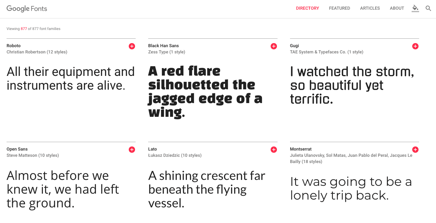
Google Fonts are AWESOME!
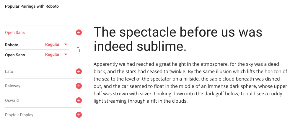
If you don’t have access to fancy typefaces, take a look at Google’s web font library. Google’s wide variety of free typefaces include Roboto, Open Sans, Lato, and more. They even have font-pairing suggestions to help you mix and match typefaces for maximum legibility. View their font library at Google.com/fonts.
Choose Your Type Wisely
The typeface you choose sets the tone for your presentation. It mirrors who you are as a company and sends a message about your brand. Don’t be something you’re not. Choose your type wisely, my dear friend.
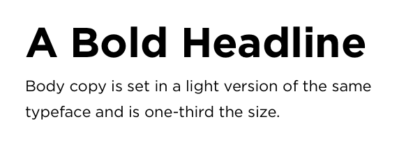
3. Organize Information With Contrast and Visual Hierarchy
Use differently sized typefaces to improve visual hierarchy, separate content, and make it clear and easy to communicate your message.
Chris Do, from the Futur, teaches designers to skip a weight in between the headline and the body copy. Go light to bold, or medium to extra bold.
Combine short blocks of copy with icons to keep it simple.
4. Draw eyes with high-resolution imagery
Stock Photography
Support your content with high-resolution photography. Your message becomes ten times more impactful with beautiful photos and well-designed visuals.
For free stock photography, check out unsplash.com, or if you have a larger budget visit Shutterstock, iStock or Getty Images.
Do not use other people’s photographs without permission. If you insist on using a photo that doesn’t belong to you, make sure to reference the site and photographer. Always give credit where credit is due.
Your Secret Weapon: Screen Captures, Animated Gifs, and Videos
5. Define a Color Scheme
Choose a unified system of colors to repeat throughout your entire presentation. Stick with a few colors and be decisive. Select a color theme that mirrors the message, your brand, and your audience.

Need Color Inspiration? Browse by Color on Dribbble.
Design for the Colorblind
According to Robyn Collinge, copywriter at Usabillia, 1 in 12 men and 1 in 200 women worldwide are colorblind. Always make sure there’s enough contrast to accommodate for everyone. Here are a few tips to steer you in the right direction:
Avoid mixing red and greenAvoid red and blueDon’t use red text, except when you’re annotating or sending an error message. Check for contrast with webaim.org/resources/contrastchecker
Try a colorblind simulator https://www.color-blindness.com/coblis-color-blindness-simulator. Don’t rely solely on color. Use shapes and textures to add contrast and communicate.
Color and Type
Yes, we’re back to talking about type again. My favorite topic.Joy!
Make sure your text is legible on all screens and environments. Black and white will deliver maximum contrast, but this can be harsh on the eyes. Never use light gray text on a white background. Those with low vision should be able to read your slides easily.
WebAim’s Contrast Checker allows you to check the contrast ratio between foreground and background colors.
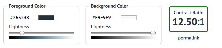
via https://webaim.org/resources/contrastchecker/
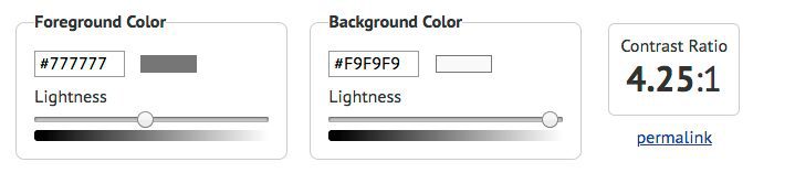
The Tale of the Understated Type
A few years ago, a trend emerged where designers created “subtle” look by applying grey text on a white background. Unfortunately, this led to contrast and accessibility issues. Even worse, a lot of templates copied this trend, which means we have thousands of websites that are still suffering from weak contrast issues. We are cleaning up the mess and getting the word out to designers to choose a darker shade of gray!
Black text on a white background provides the most contrast, but it can appear stark. Keep in mind that you don’t have to use #000000 as black. #000333 is known as a rich black and doesn’t look as flat as #000000.
Type weights and contrast
There are many ways to communicate elegance without compromising legibility. Choose a typeface that has a lot of weights.
Always double check that there is enough contrast between the foreground and the background with an accessibility checker such as webaim.org.
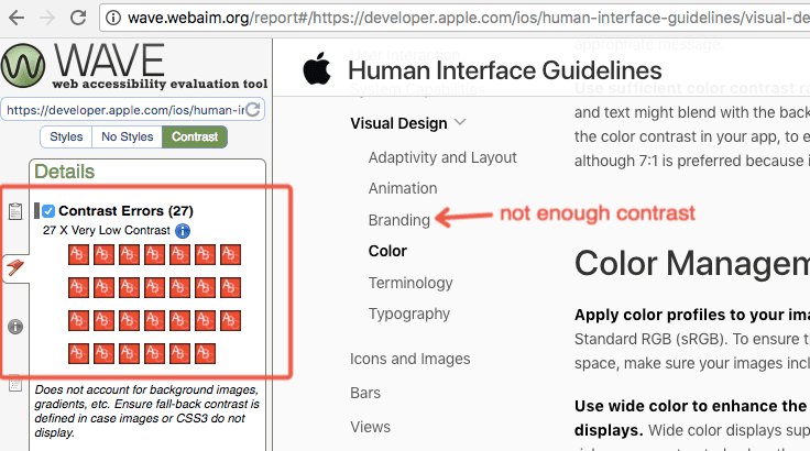
Important: Follow Trends with Caution
Oh, the irony! Apple, the king of design has 27 contrast issues on their Human Interface Guidelines!
6. Use Simple Animations and Transitions
Animation can enhance your message or distract from it. Transitions and animations create emphasis, but too much of it is annoying. Use simple fade-ins and fade-outs to gradually present information. Once in a while, you can add a little pizzazz to entertain your audience.

7. Showcase your Personality
Be proud of who you are, and be appropriate for your audience.
In Conclusion
Put some pizazz in your slides by considering the tips in this post. Stay tuned because we have more UX and digital product design content coming your way, from yours truly.
About Andi Galpern
Andi Galpern is the founder and producer of Cascade SF, an experience designorganization in the Bay Area. Her events provide a go-to space for product designers to learn new skills, connect with industry leaders, mentor, and stay ahead of the job market. Everyone works together toward a more fulfilling career.
Since 2011, Andi has organized hundreds of design and technology events to bring communities together. She regularly works with designers around the world to help them create presentations and become leaders. Follow her on Twitter@andigalpern.